

DYNC1H1 ORG
Transforming the DYNC1H1 Association’s Squarespace website to be more accessible, readable and engaging. Equipping the organization with a consistent visual identity to incorporate across their site.
[My Role]
Web Designer
[Areas]
Web Design, Accessibility
This project is ongoing, and this page is still under construction. In the meantime, some work has been displayed for a general overview.
PROJECT OVERVIEW
-
Improve accessibility, architecture, readability, and flow of the DYNC1H1 website. Help the founders plug and play new content by creating a consistent visual identity and ‘saved section’ templates within Squarespace.
-
Web Design through Squarespace
Biggest Problem Areas
No cohesive design language or visual identity
Disorganized, chaotic, and cluttered layout with little to no hierarchy
Frequent use of infographic images that are not accessible to visually impaired users
Repetitive content
No direction/flow between pages
A home page that is severely lacking in information, storytelling, and direction.
Lengthy and bad UX writing throughout the website.
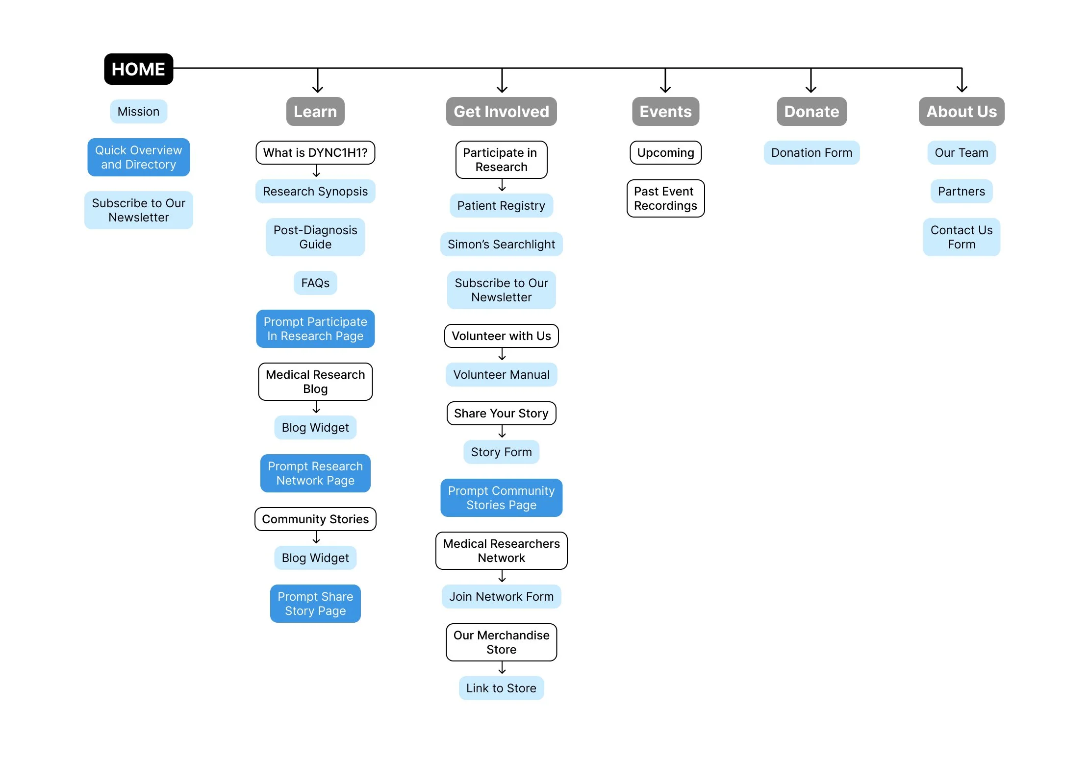
Consolidating site architecture
Originally the website had information scattered in pieces across 21 separate pages. I was able to categorize the sections of importance, understand what content could be placed together, and restructure the site to only 13 pages.
Grey - Navigation menu
White - Drop-down Titles / Pages
Light blue - Content subgroups within the page
Dark blue - Links that direct to other sections
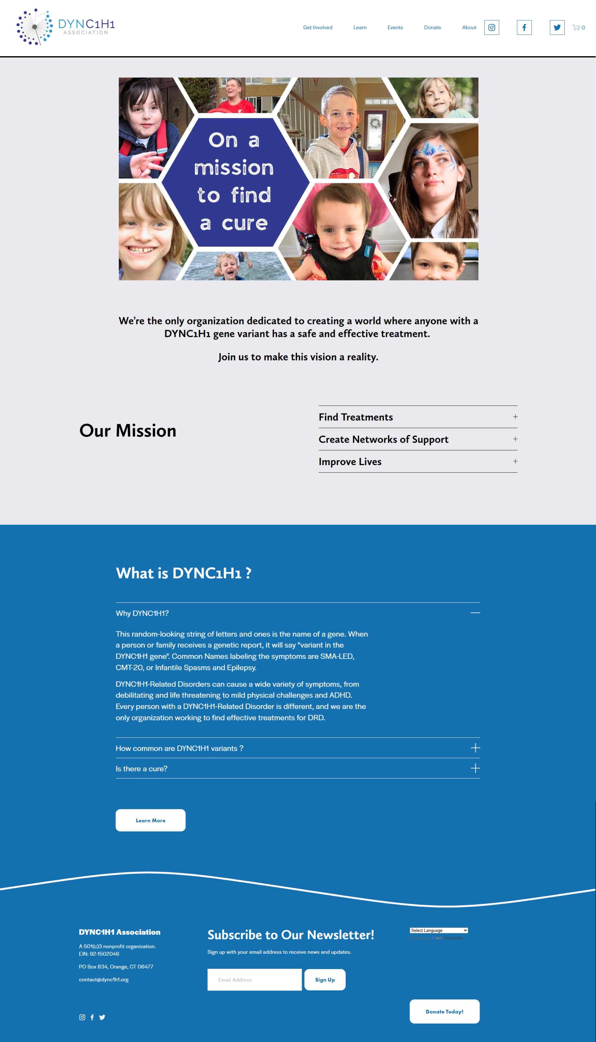
Original Homepage
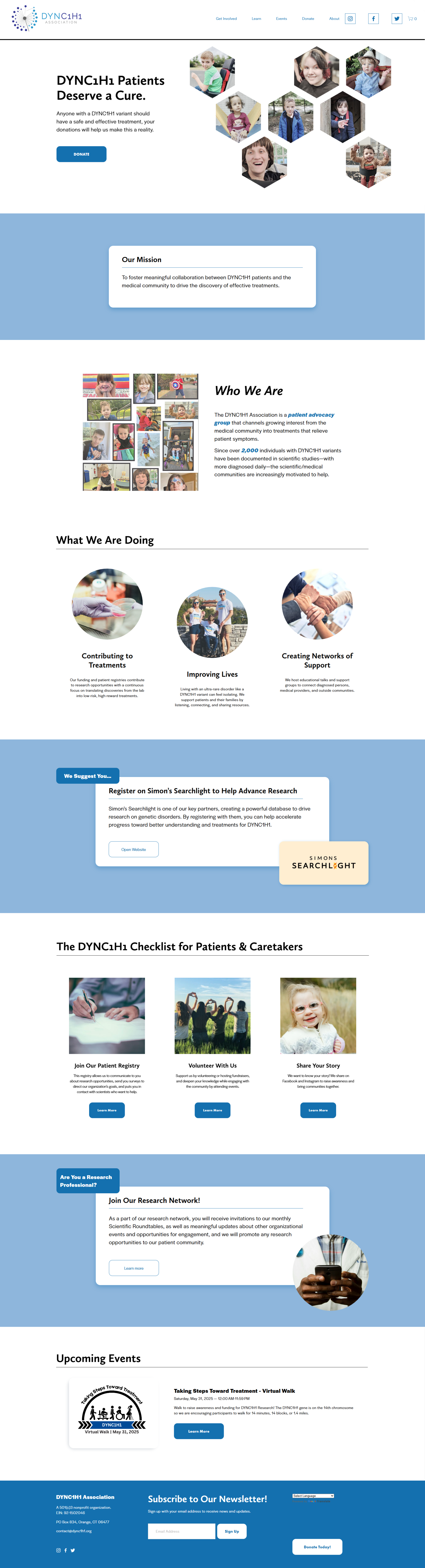
Revised version
Original “WHat is dync1h1” page
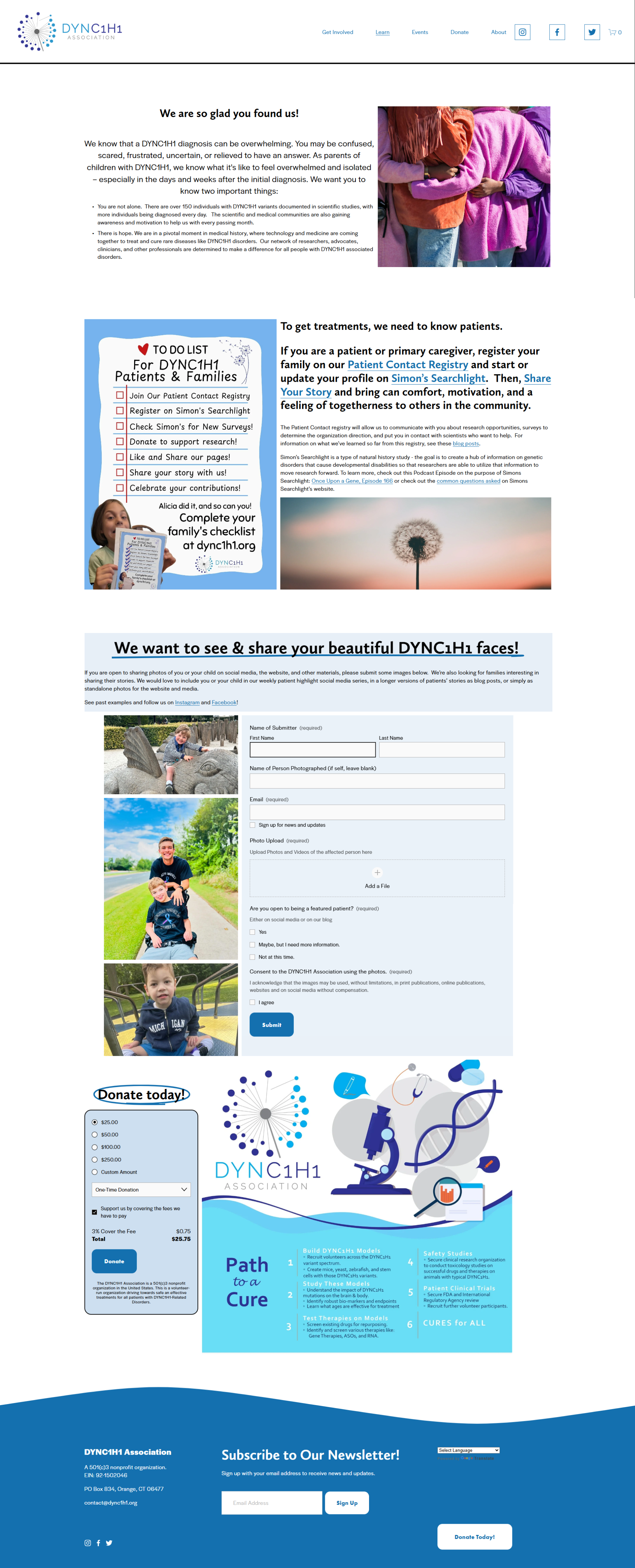
Revised version
